
Branding & Identity
A mixtape of logos, marks, logotypes, and their applications.
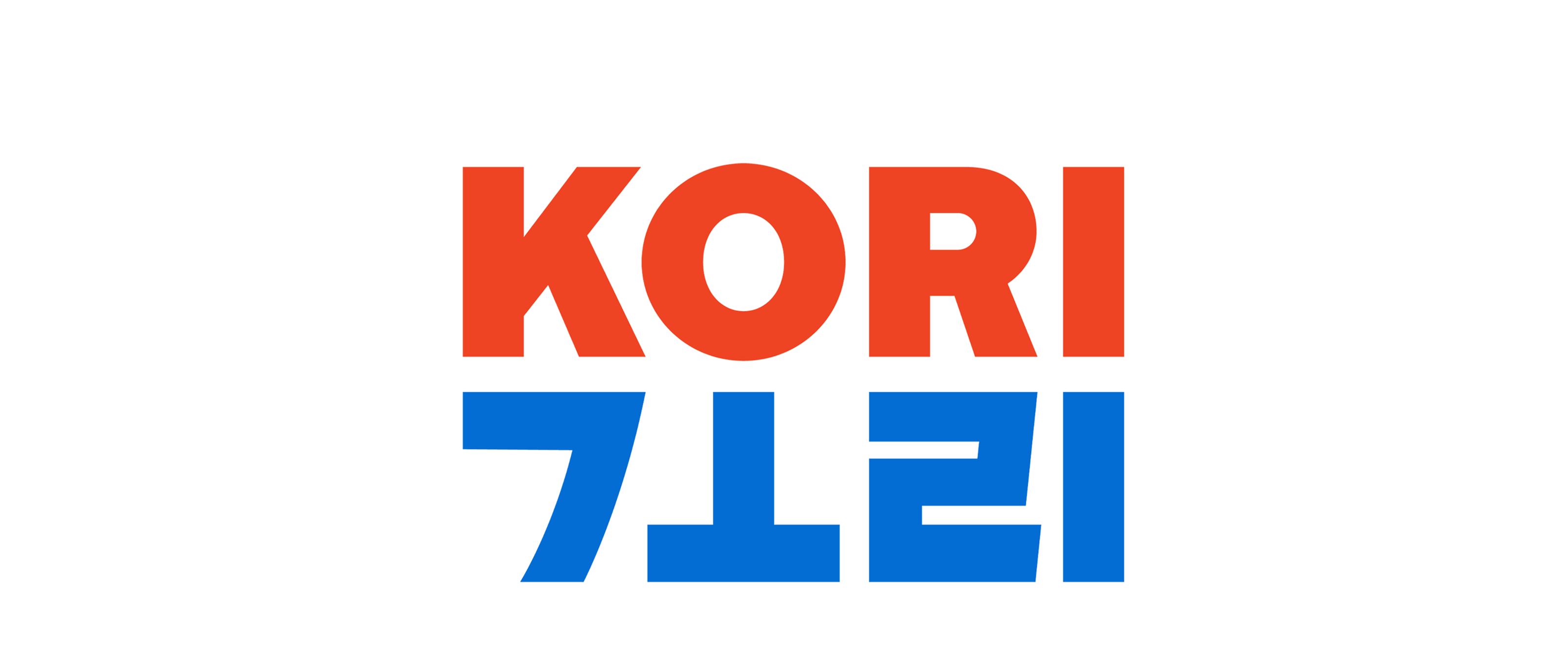
Stacked

Single line
Kori Studio
Flags represent the essential identity of a nation. Red and blue, the dominant colors of both Korean and American flags, are in constant opposition to one another. They make us stop or go and turn water hot or cold. The colors blanket the United States with a red and blue quilt, and divide the Korean peninsula into two.
Kori means ‘link’ in Korean. The characters from both the Latin and Hangul letterforms correspond perfectly with each other in the way they look and sound, despite all their differences.

River Café
My final project before graduating School of Visual Arts was my first full-blown branding project. I had to find time to squint at bezier curves while sleeping under desks with bleeding fingertips sliced open with an X-Acto blade—an experience commonly known as a student internship.
Instructor: Michael Ian Kaye
Mark

Lock up with logotype

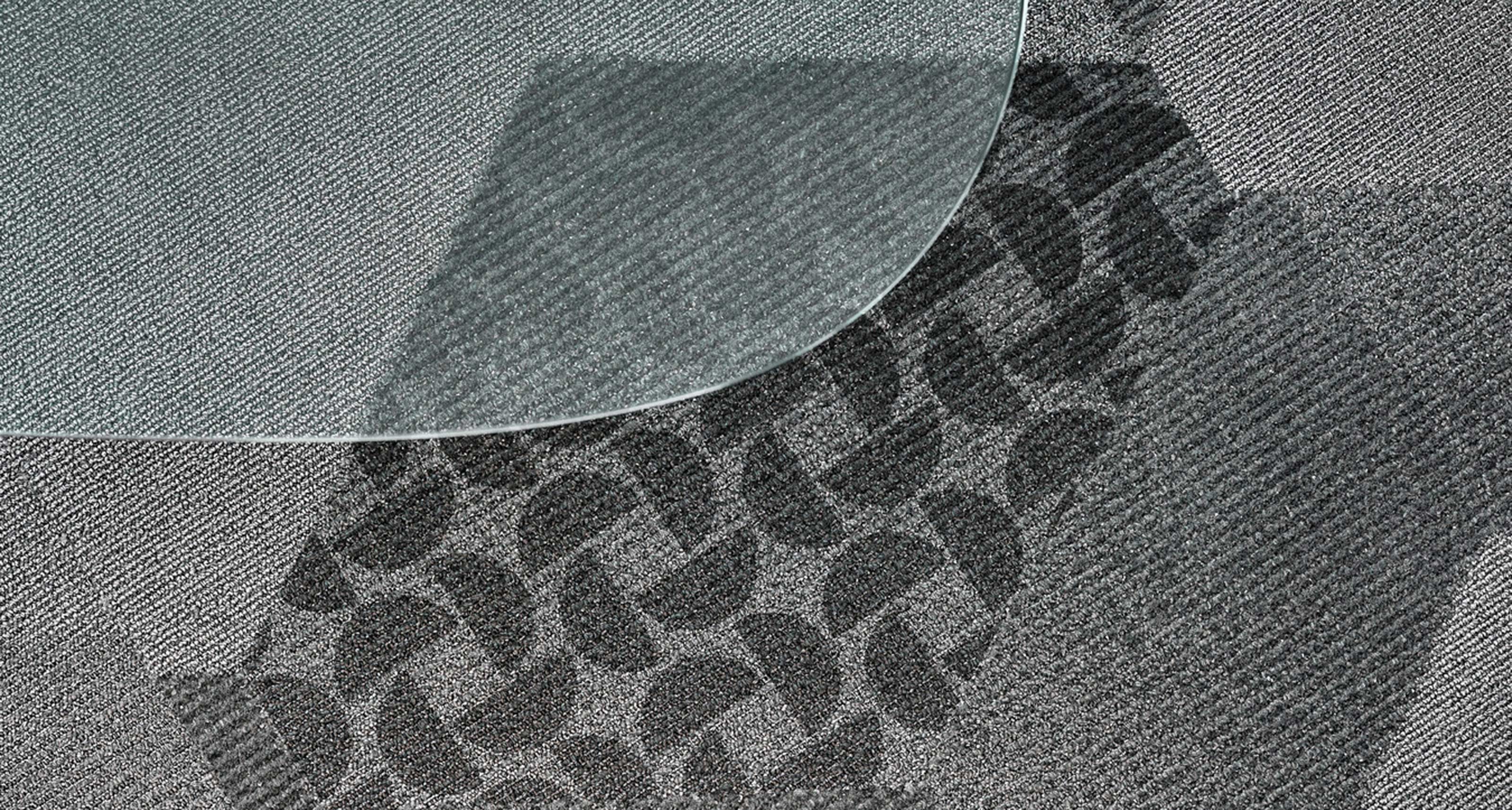
Starwood Hotels & Resorts
They might be deconstructed beyond recognition but the base forms of the letters S and W are represented, and reconstructed into a star that is there but not there.
Agency: Ogilvy & Mather, New York
Creative Direction: Michael Ian Kaye
Logotype Design: Bill Darling
Creative Direction: Michael Ian Kaye
Logotype Design: Bill Darling
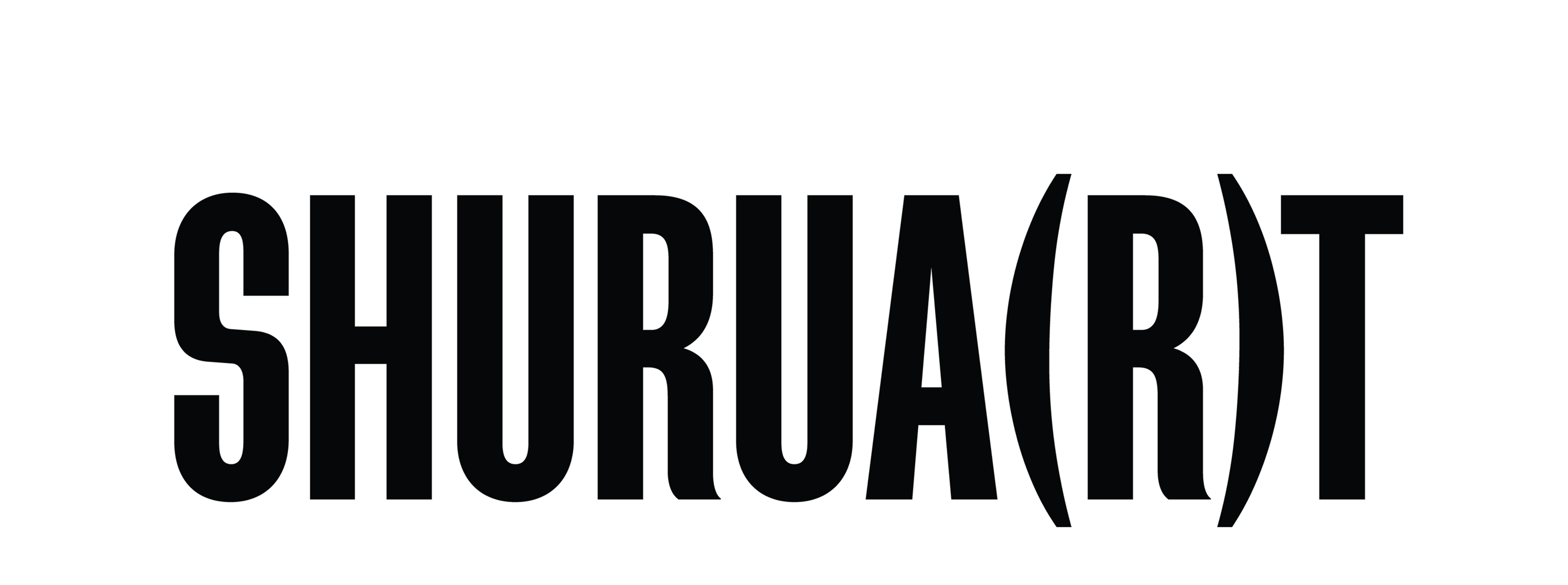
Shuruart
Shuruart is a platform for independent and student artists in India where they can showcase and sell their artwork. ‘Shuruat’ means ‘to start’ in Urdu and the goal was to incorporate the word ‘art’ into it. As it happens sometimes, punctuation came to the rescue.
Client: Shuruart, Varanasi, India
SUNS
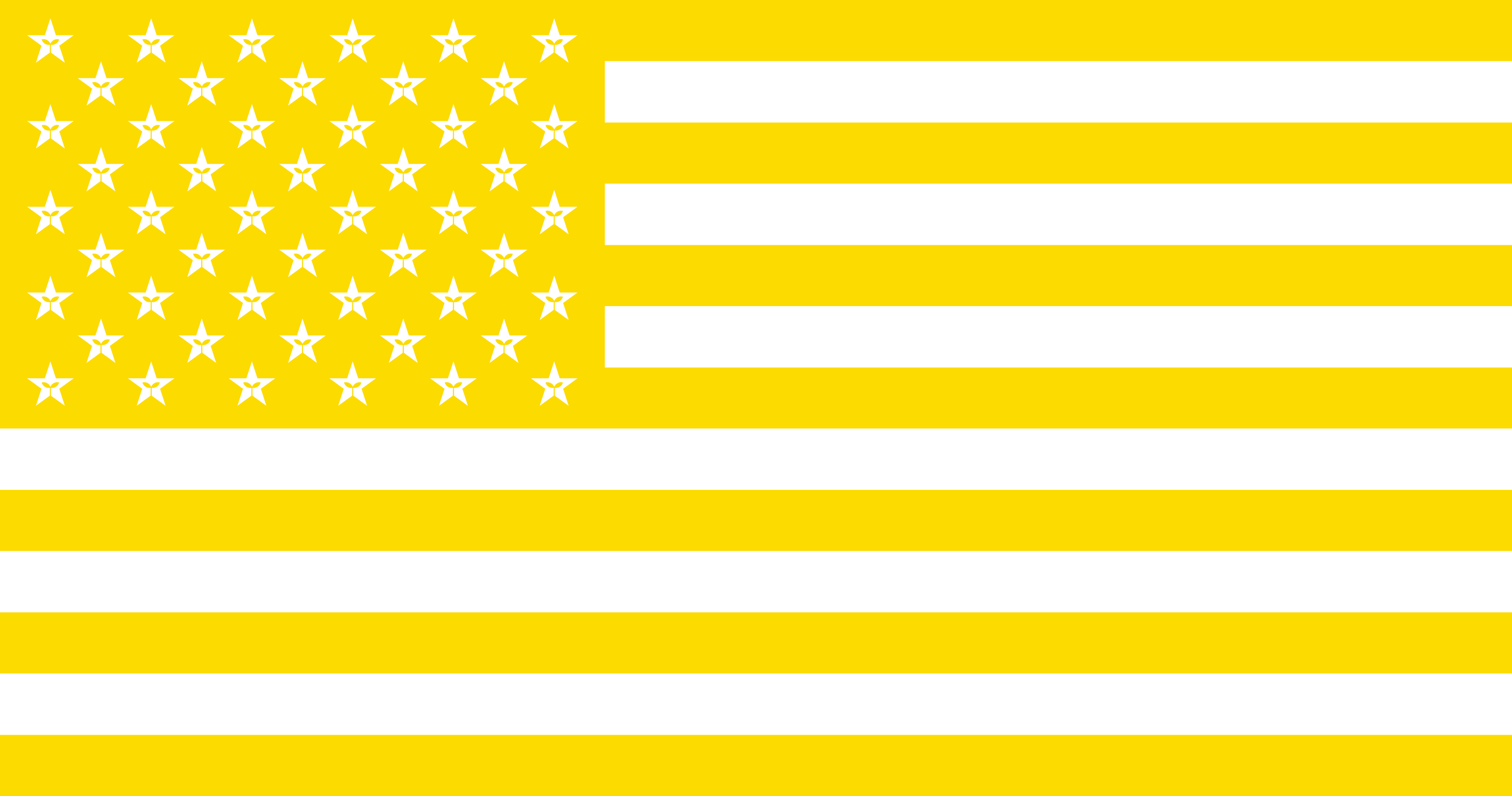
The rationale for this design was that our sun is but a star, but in retrospect I admit that it’s a bit confusing to name a company SUNS only to slap a star on it.

Before

After
Gloria Vanderbilt
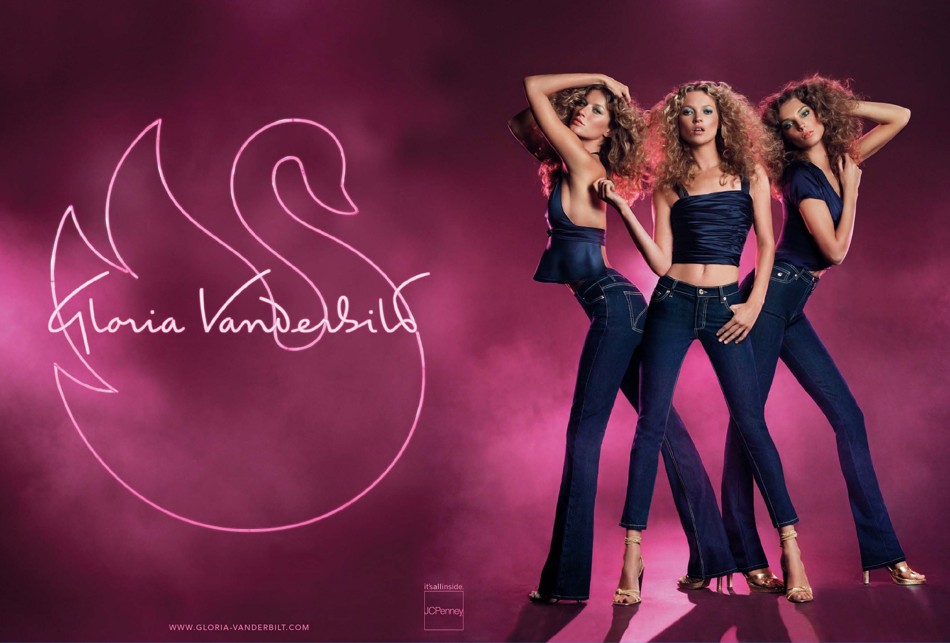
This script, as well as the swan, was reimagined by Jean François Porchez. It was the only occasion that something I worked on was made into a neon sign flanked by supermodels.
Agency: AR New York
Typographer: Jean François Porchez
Art Direction: Phillip Duncan
Photographer: Inez & Vinoodh
Typographer: Jean François Porchez
Art Direction: Phillip Duncan
Photographer: Inez & Vinoodh
LifeLink
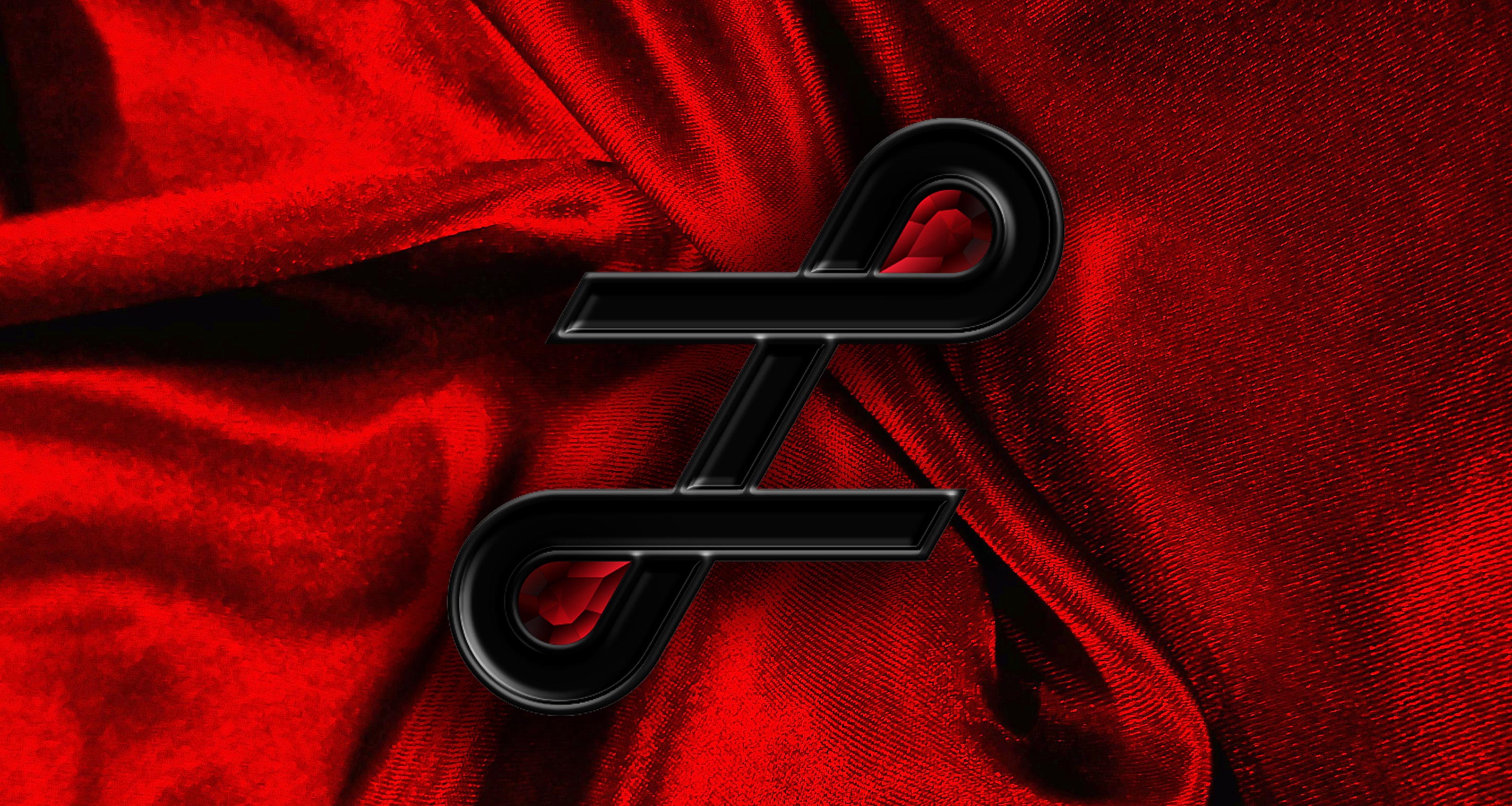
LifeLink was Coty’s partnership with DKMS, a bone marrow donor nonprofit based in Germany. Two blood-red rubies are linked together with a ribbon in the shape of an L, signifying the perfect match between a blood cancer patient and a donor.
Agency: Select World
Client: Coty, New York
Client: Coty, New York

Before

After

Mark
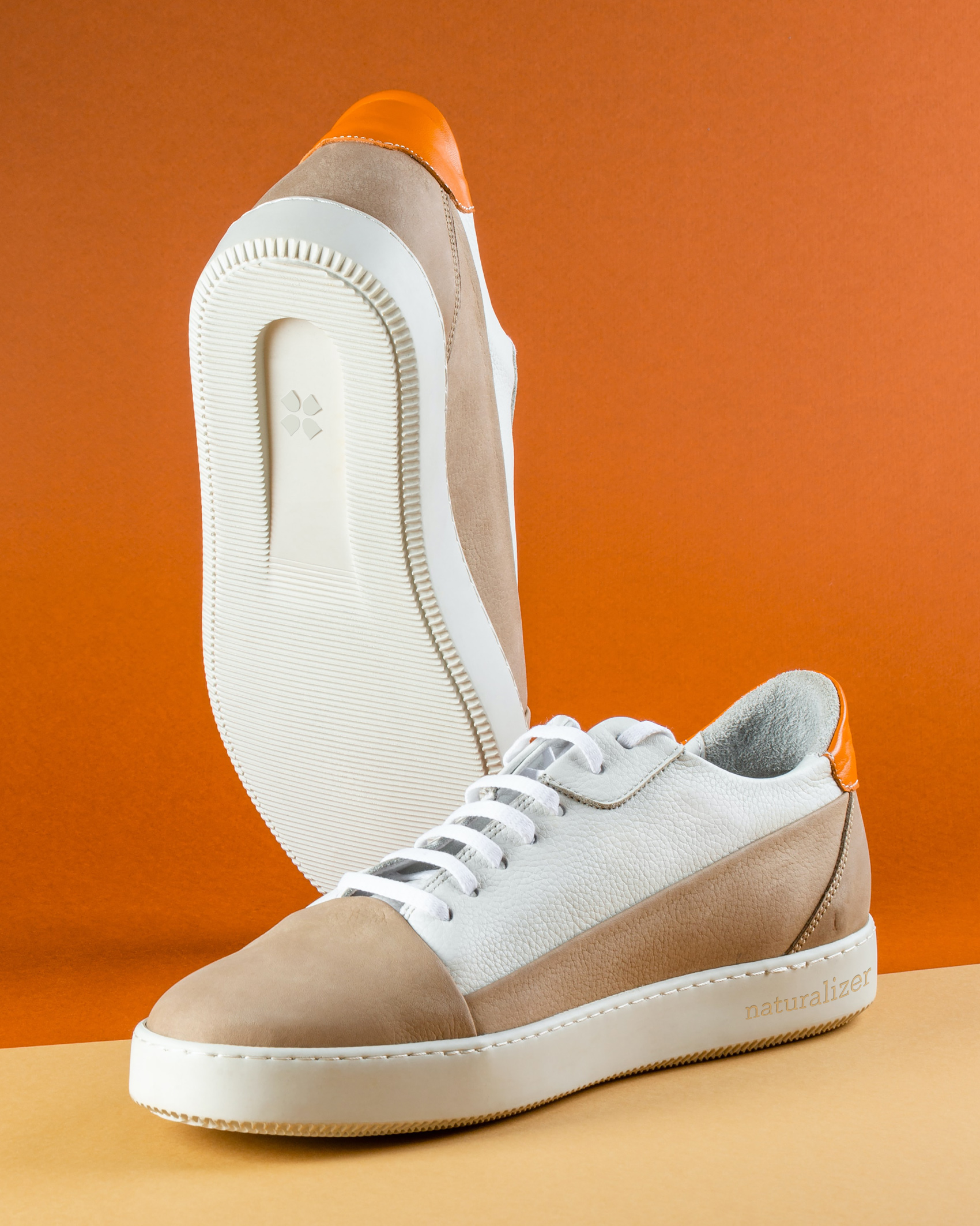

Naturalizer
A mass-market footwear company gets a makeover to appeal to a younger and hipper demographic.
Agency: AR New York
Creative Direction: Michael Ian Kaye
Typographer: Ian Brignell
Creative Direction: Michael Ian Kaye
Typographer: Ian Brignell
Before
After
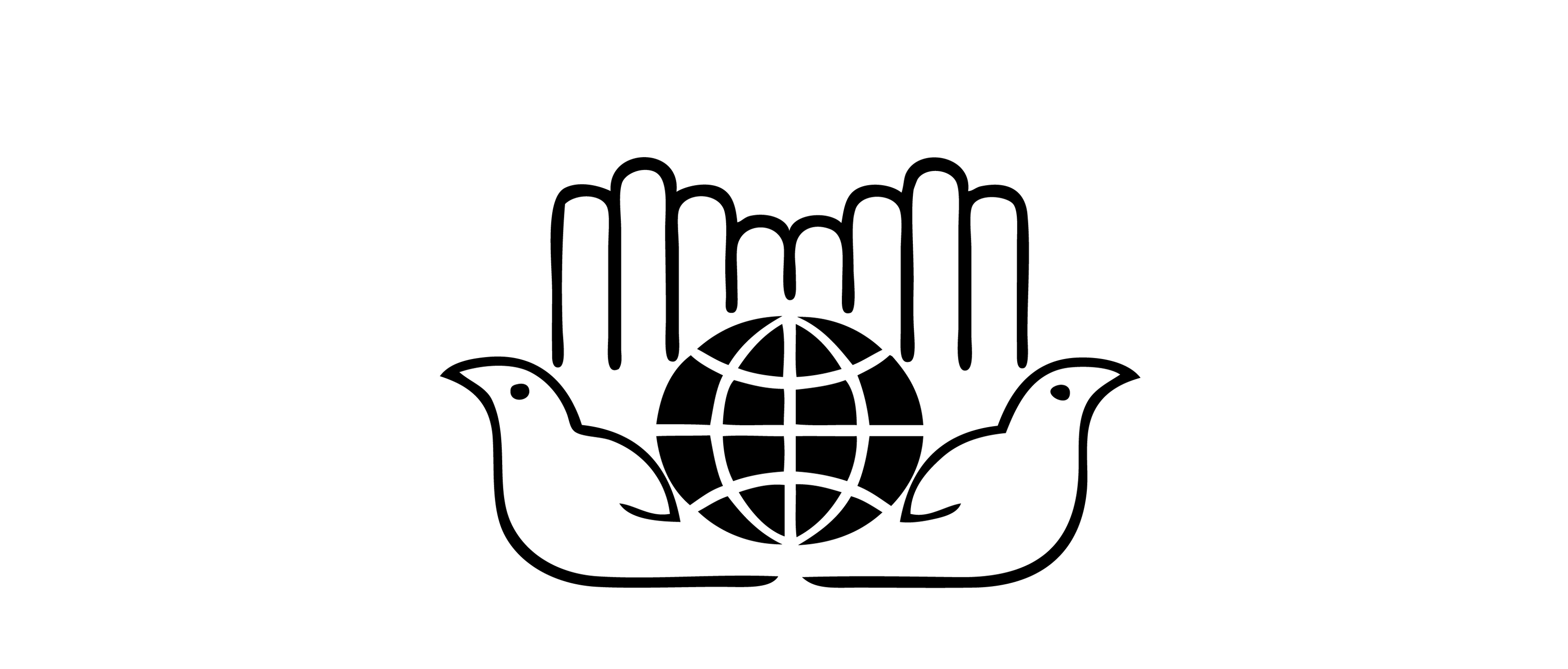
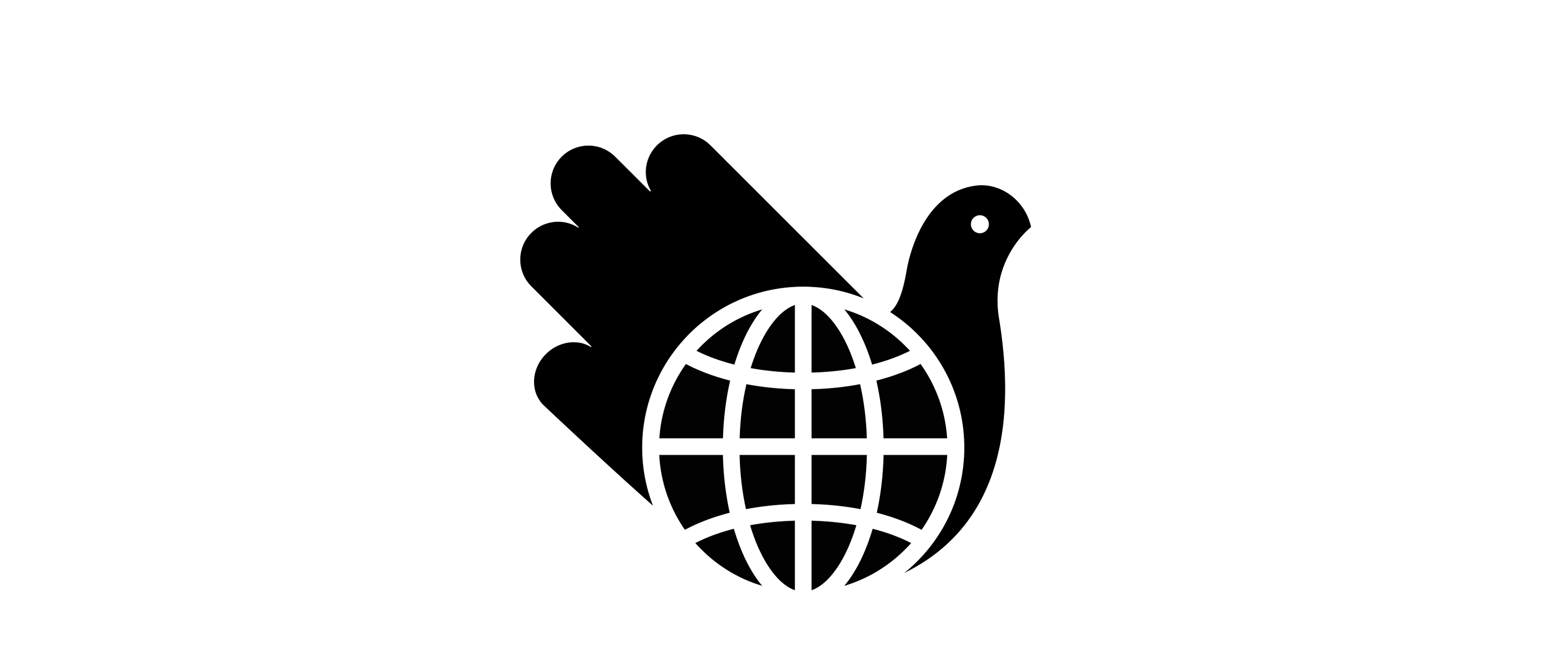
Center for International Humanitarian Cooperation
I found the original birds rather scary and the mirrored hands slightly redundant. Collaboration with Spencer Bagley.
Client: CIHC, New York
Monogram: Before

Monogram: After


St Regis Hotels & Resorts
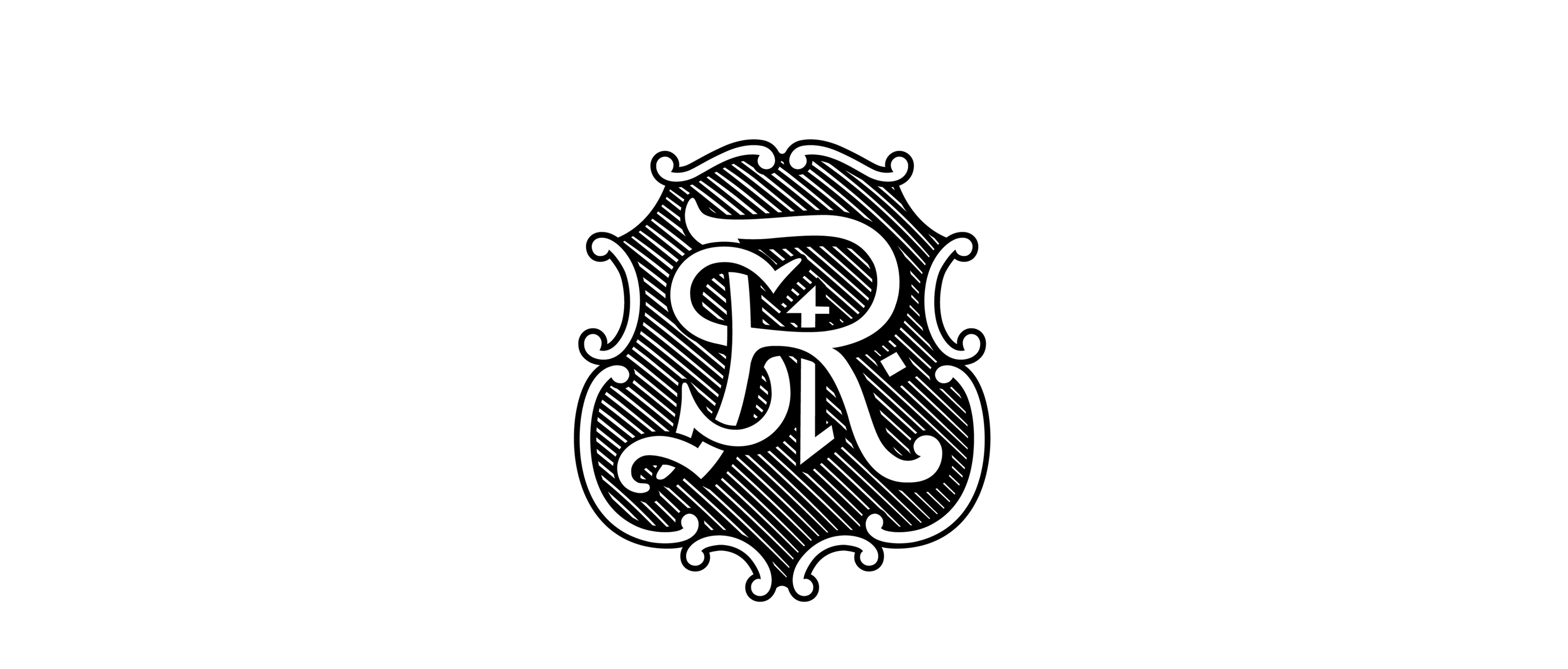
The St Regis brand is infused with a century of history, so proposing a new brand language that required a drastic rethinking was a huge challenge. Gasps were heard around the conference room when the ornamental crest was removed from the monogram.
Agency: AR New York
Creative Direction: Michael Ian Kaye
Team Dana Goor, Bitna Hu, Charlotte Pao
Creative Direction: Michael Ian Kaye
Team Dana Goor, Bitna Hu, Charlotte Pao
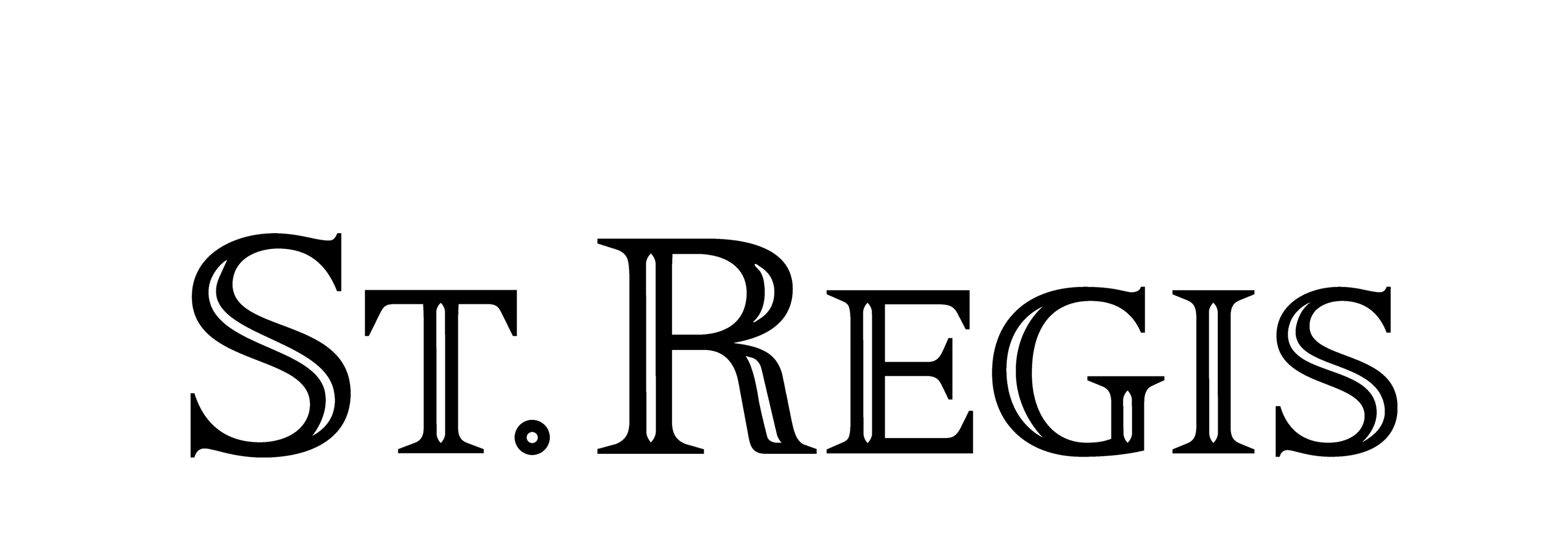
Logotype: Before

Logotype: After
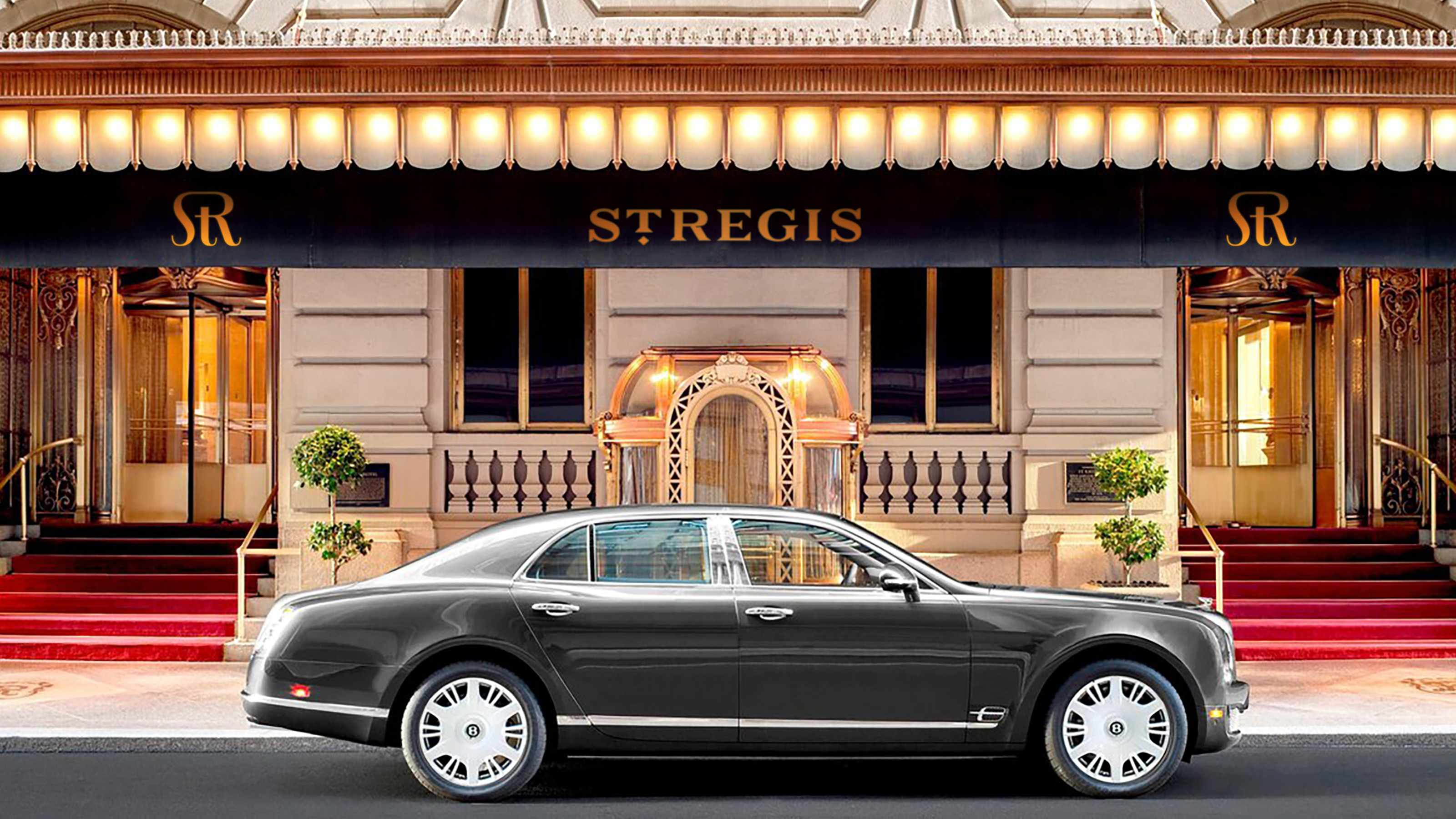
St Regis Hotels & Resorts
I recently played around with this design again because I was curious to see it with ink traps. I was immensely inspired and heavily influenced by Redaction.
Agency: AR New York
Creative Direction: Michael Ian Kaye
Team: Dana Goor, Bitna Hu, Charlotte Pao
Creative Direction: Michael Ian Kaye
Team: Dana Goor, Bitna Hu, Charlotte Pao
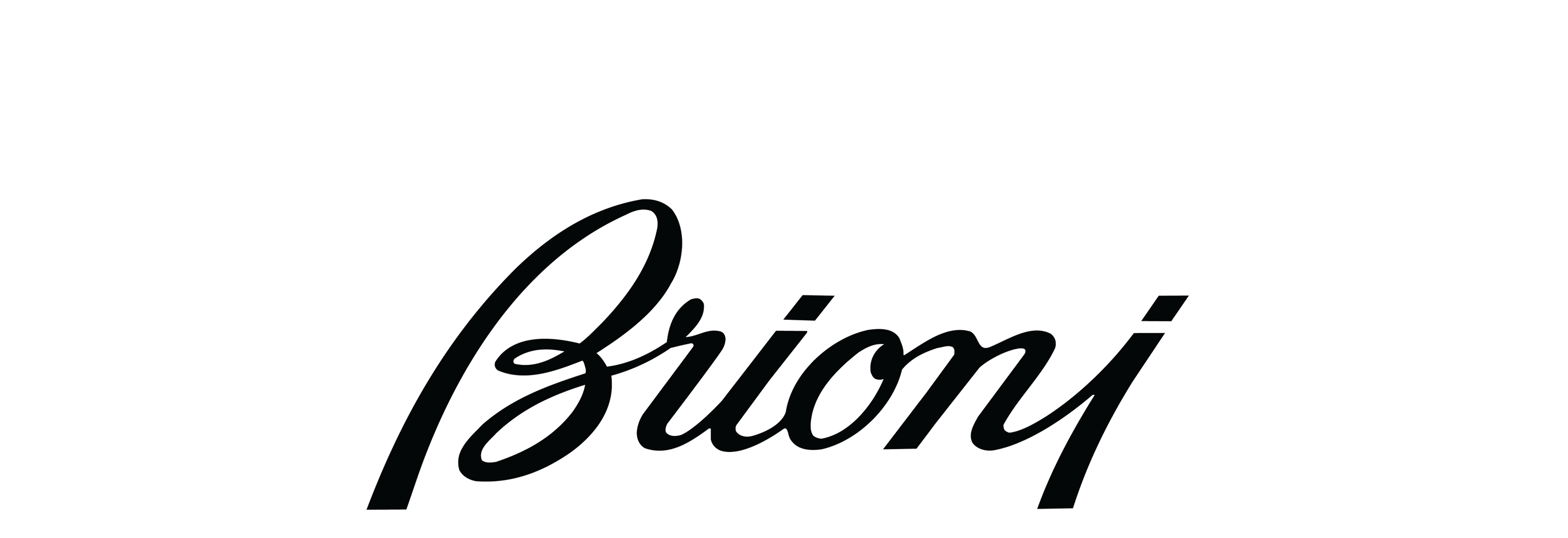
Before
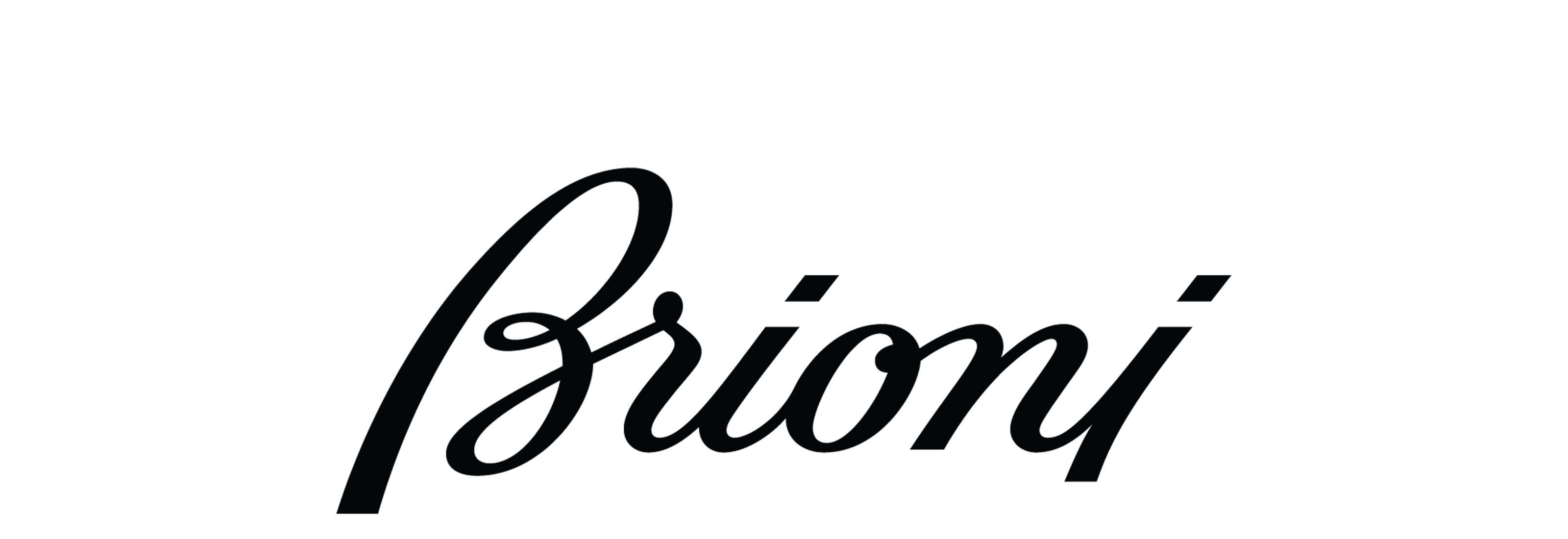
After


Brioni
Another script collaboration with Jean François.
Agency: AR New York
Typographer: Jean François Porchez
Creative Direction: Michael Ian Kaye
Photographer: Inez & Vinoodh
Typographer: Jean François Porchez
Creative Direction: Michael Ian Kaye
Photographer: Inez & Vinoodh

Before

After

Firewood Marketing
This project was the most complex branding project I have worked on and rightfully deserves its own page, which will be coming soon.
Client: Firewood Marketing, San Francisco
Creative Direction: DJ Carey
Creative Direction: DJ Carey
